How to Make AI-Generated Frontend Code Stop Looking Cheap
Six practical techniques to eliminate the "AI look" from your generated UI — from design tokens to micro-interactions.
The code works. The layout renders. The data loads. But something is off — the padding is uneven, the colors feel wrong, and nothing animates. You can tell an AI wrote it within two seconds.
This isn’t about AI tools being incapable. Claude, Cursor, v0, and Copilot generate functional UI code remarkably well. The problem is that they generate *generic* UI — the mean of all the training data, smoothed and averaged and completely devoid of personality.
Here’s a practical guide to closing that gap, backed by real tools and techniques you can apply today.
What “Cheap” Actually Means
Before we fix it, let’s name the symptoms. AI-generated frontend code typically fails in six consistent ways:
1. Inconsistent spacing. AI doesn’t know your spacing system — 4px, 8px, 12px? Each component gets an independent guess at padding and margin. One card has 16px padding, the next has 20px. The sections drift apart and together at random intervals.
2. Missing color system. The default AI output trends toward light gray backgrounds, blue primary buttons, and white cards — because those are the most common patterns in its training data. It doesn’t know your brand colors, your accent palette, or how your dark mode should map.
3. States are forgotten. :hover, :focus, :active, :disabled — AI generates the default state and stops. The user gets no feedback that a button was clicked, that an input is focused, or that a submission is loading.
4. Zero motion. The entire page renders instantly. No transitions, no feedback, no entrance animations. The “static snap” is the easiest AI fingerprint to spot.
5. Flat typography. AI tends to use the same font-size and font-weight everywhere. Heading levels blur together. Line-height, letter-spacing, and max-width are often missing entirely.
6. No brand character. AI generates furniture, not a home. There’s no custom design language, no distinctive interaction details, no voice in the copy.
The core insight: AI-generated UI doesn’t look *ugly* — it looks *flat*. The cheapness comes from an absence of deliberate choices, not from bad ones.
Step 1: Give AI a Design System Specification
This is the single highest-impact change you can make. Drop a DESIGN.md file in your project root that tells the AI your design constraints explicitly.
Here’s a minimal working example:
# Design System
## Spacing- Base unit: 4px- Card padding: 24px- Component gap: 16px- Section gap: 32px
## Colors- Primary: #1a3a5c- Accent: #635bff- Neutral: #333333 (body), #666666 (muted), #f5f5f5 (bg)- Success: #27ae60 / Warning: #f39c12
## Typography- Font: system font stack- Heading: 1.75rem/700, Subheading: 1.25rem/600, Body: 1rem/400- Line height: 1.6- Max reading width: 680px
## Border Radius / Shadows / Transitions- Buttons: 6px, Cards: 8px, Modals: 12px- Card shadow: 0 2px 8px rgba(0,0,0,0.08)- Default transition: 200ms ease-in-out
Why it works: Once you tell AI that spacing is on a 4px grid, it stops generating padding: 15px and margin: 18px. The improvement is immediate and visible.
Resources:
- DESIGN.md Spec — an open standard for AI-readable design system files
- design-md-library — 14+ ready-to-use design system files for SaaS, fintech, health, e-commerce, and creative agency sites
Step 2: Constrain Code Style with Project Config Files
Most AI coding tools respect project-level configuration files like CLAUDE.md, AGENTS.md, or .cursorrules. Use them to formalize your quality rules:
# Frontend Code Generation Rules
## General- Every interactive element must define hover, focus, active, and disabled states- Colors must reference design tokens — no hardcoded hex values- All spacing must follow the 4px base grid- Every interactive element must have a transition or animation
## Component Requirements- Button: 4 variants (primary / secondary / outline / ghost), each with 4 states- Card: uniform 8px radius, 24px padding, subtle shadow- Modal: backdrop overlay + scale-in animation + click-outside-to-close- Form: top-aligned labels, red error messages + icons, focus glow on inputs
## Forbidden- No inline styles (except dynamic values)- No show/hide toggles without transitions- No hardcoded color values
The AI reads these files before every generation cycle. You’re effectively putting a design straitjacket on the model — and it works.
Step 3: Write Better Prompts
The same request, phrased differently, produces wildly different quality:
❌ Bad prompt:
“Build me a login page.”
✅ Good prompt:
“Build a login page inspired by Stripe’s design: white background, dark gray body text, primary color #635bff, 6px border-radius buttons, centered card layout, hover and focus states, and form validation feedback.”
The difference is obvious in the output.
A reusable prompt template:
Generate a [component type].
Design constraints:- Style reference: [Stripe / Linear / Vercel / specific brand]- Colors: [primary, accent, background]- Spacing: [base unit]- Font: [font name]- State coverage: hover, focus, active, disabled, loading- Motion: transition duration [X]ms with [ease-out] easing- Responsive: [breakpoint description]- Banned: [inline-style / specific libraries]
The shortcut: Name-dropping a real brand is more effective than describing it for 100 words. AI already knows what Stripe, Linear, and Vercel look like. Referencing a brand loads its entire design vocabulary into context.
Step 4: Micro-interactions — The 20% That Separates Pro from Amateur
AI generates static UI by default. Adding micro-interactions is the most efficient way to cross the line from “okay” to “professional.”
Low-cost micro-interactions worth implementing:
| Interaction | Implementation | Lines |
|---|---|---|
| Button press feedback | transform: scale(0.97) + transition | 3 CSS |
| Card hover lift | translateY(-2px) + deeper shadow | 4 CSS |
| Staggered list entrance | animation-delay increment + fadeInUp | 5 CSS |
| Modal backdrop fade | opacity 0→1 + backdrop-filter: blur | 4 CSS |
| Skeleton loading | CSS gradient shimmer animation | 6 CSS |
| Input focus glow | box-shadow transition + border gradient | 3 CSS |
The key rule: Keep durations consistent (200-300ms) and easing consistent (ease-out). Inconsistent animation parameters create a chaotic feel that’s worse than no animation at all.
Step 5: Typography and Spacing Discipline
Good design subtracts more than it adds. These rules will clean up any AI-generated page immediately:
- Maximum reading width: Keep body content under 680px (about 65-75 characters per line)
- Line height: Body text at minimum 1.6, headings at 1.2-1.3
- Avoid pure black: Replace
#000with#1a1a1aor#333 - Gray hierarchy: Body
#333, muted#666, placeholder#999, disabled#ccc - The whitespace rule: Remove 20% of the content — the remaining 80% will look 50% better
Tailwind recommended config:
// tailwind.config.js — 4px spacing gridspacing: { '0.5': '2px', '1': '4px', '1.5': '6px', '2': '8px', '3': '12px', '4': '16px', '5': '20px', '6': '24px', '8': '32px', '10': '40px', '12': '48px',}Step 6: Automated Checks and Post-processing
Catch the common cheapness patterns with simple scripts:
# Check for hardcoded colorsgrep -rn 'color: #[0-9a-f]\{6\}' src/ --include="*.tsx" | grep -v 'colors.ts'
# Check for hover/focus without transitionsgrep -rn ':hover\|:focus' src/ --include="*.css" | grep -v 'transition'
# Check for non-4px-base spacing valuesgrep -rn 'padding\|margin' src/ --include="*.css" | grep -oP '[0-9]+px' | sort -u
Or use existing enforcement tools:
- ui-stack (open source) — a Claude Code design system skill that enforces 8px grids, semantic colors, state coverage, and micro-interactions automatically
- Custom ESLint rules to flag undefined CSS variable references
Before and After
❌ Unconstrained AI output:
<button style="background: #0066ff; color: white; padding: 10px 20px; border: none; border-radius: 4px; cursor: pointer;">Submit</button>Problems: hardcoded colors, non-grid padding, zero states, no transitions, inline styles.
✅ Design-constrained AI output:
<button className="btn-primary">Submit</button>
.btn-primary {  background: var(--color-primary);  padding: var(--space-3) var(--space-6);  border-radius: var(--radius-md);  font-weight: 600;  transition: all 200ms ease-out;}.btn-primary:hover {  background: var(--color-primary-dark);  transform: translateY(-1px);  box-shadow: 0 4px 12px rgba(99, 91, 255, 0.3);}.btn-primary:active {  transform: translateY(0);  box-shadow: none;}.btn-primary:focus-visible {  outline: 2px solid var(--color-primary);  outline-offset: 2px;}.btn-primary:disabled {  opacity: 0.5;  cursor: not-allowed;}
Toolchain Summary
| Tool | Purpose |
|---|---|
| DESIGN.md Spec | Define design systems in Markdown, AI-readable |
| design-md-library | 14+ prebuilt design system files (free, open source) |
| ui-stack | Claude Code design system skill with configuration UI |
| shadcn/ui | Component library + Tailwind — produces consistent output with AI |
| DesignArena | Crowdsourced benchmark for evaluating AI-generated UI quality |
| Tailwind CSS | Atomic CSS limits random values — the more constrained the framework, the more consistent the output |
Recommended workflow:
- Project setup — Pick a template from design-md-library or write your own
DESIGN.md - Before coding — Drop
CLAUDE.md/AGENTS.md+ design tokens in the project root - During coding — Prompt with “follow the design system in the project config” + name-drop a brand reference
- After coding — Run a lint script to catch hardcoded colors and off-grid spacing
- Iteration — Review each new component against
DESIGN.mdfor consistency
Final Thought
The “cheap AI look” is not a capability problem — it’s a constraint problem. AI models don’t know your design standards unless you tell them. Give them a design specification (DESIGN.md), a code style guide (CLAUDE.md), and a feedback loop for iteration, and the output quality jumps dramatically.
The principle in one sentence:
Don’t expect AI to guess your design standards. Define them, and it will follow them.
As formats like DESIGN.md become standard and AI coding tools add native design system support, this problem will fade. But today, the developers who explicitly define AI’s design boundaries are the ones producing work that doesn’t look AI-generated.
References:
- DESIGN.md Spec & Library — design-md-web.pages.dev
- ui-stack — GitHub: rashoodkhan/ui-stack
- DesignArena — designarena.ai (crowdsourced AI UI benchmark)
- shadcn/ui — ui.shadcn.com
- Tailwind CSS — tailwindcss.com
- Claude Code — docs.anthropic.com (CLAUDE.md mechanism)

ChatGPT Adoption Shows AI Is Becoming a Daily Global Utility
OpenAI data reveals that users send 50% more messages after 6 months, non-English speakers now make up the majority of active users, and the number of distinct use cases per user has doubled — signaling ChatGPT is moving from a novel chatbot to a daily global utility.

AI Agents Are Moving From Chat to Delegated Work
OpenAI research shows 80.6% of Codex users have delegated tasks exceeding 30 minutes of human work. The age of AI-as-chatbot is giving way to AI-as-delegated-worker, and the implications extend far beyond software engineering.
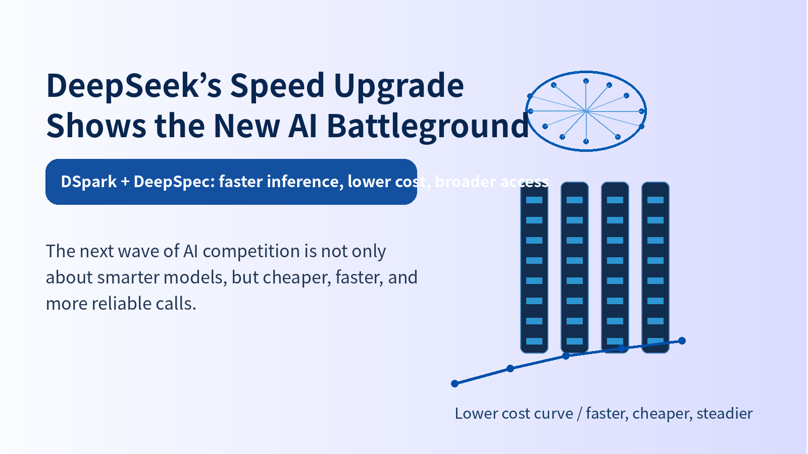
DeepSeek's Speed Upgrade Shows the New AI Battleground
DeepSeek V4 introduces DSpark speculative decoding, boosting inference speed by 60-85%. The next AI battleground is not smarter models but cheaper, faster, more reliable engineering.